My colleague Valeria Croce asked me to record visually two fantastic sessions she organised on “Trust” with renowned speakers. I reproduce here, to accompany my visual notes, the essential passages of the articles that Valeria wrote after the sessions, as a report.
Resilient teams: how trust underpins care and performance in teams

To trust each other at work is even more important in the context of hybrid or remote work, with limited human interaction and the difficulty to reach out to new people!
Chris Tamdjidi shared with us the evidence and learnings he collected through the years working with teams inside and outside the Commission, focussing on the important role of trust in teamwork. He observed that:
- It is difficult to build a culture of collaboration: while most teams have established processes to perform tasks, they don’t have established processes to improve how they work together,
- During Covid he observed an increase in individual productivity, but a decrease in collaborative productivity: it takes more effort to connect with others and collaborate in a remote setting.
- We risk to work in micro-silos, narrow connections because of remote working – we maintain the relationships we already have, it takes efforts to build new ones.
This is why it is important to build team habits that help strengthen collaboration, team resilience and trust, especially in a hybrid environment. These habits are: Habits of attention; of connection; and of positivity.
Why being trusted (or distrusted) matters
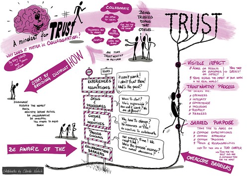
Trust is critical to create an environment where colleagues collaborate, share knowledge, engage and contribute to the achievement of the shared purpose. Yet, trust-based relationships require time to be built. What can we do to start building trust from the very beginning of a new collaborative project with colleagues from outside our team or unit?
Hilary Sutcliffe and Vanja Skoric shared lessons they learned working for over 130 civil society projects.In a nutshell, they identify four areas, where most barriers to trust and collaboration can be found, namely:
- Prior experiences and assumptions
- Skills and procedures
- Culture and incentives
- Process concerns
Three aspects that are crucial to overcome barriers are: A (truly) shared purpose; a trustworthy process (based on seven drivers of trustworthiness: openness, integrity, competence, inclusion, respect and fairness); and a visible impact.
See also Hilary Sutcliffe’s blog post where she talks about this session, and says “[…]this wonderful graphic interpretation of the event by Claudio Nichele“.