What is visual thinking and what are its benefits

In this post, I explain what is a visual thinker and the benefits of using the visual approach for individuals, groups and managers. Originally, it was a document that I shared with my superiors and colleagues to help them better understand. Then I thought that everyone could benefit from it.

Update (21 May 2024): If French isn’t a problem for you, then you might enjoy listening to this podcast where I try to answer some questions about visual thinking. What is sketchnoting, visual note taking? What benefits can this visual practice bring you in a professional environment or in your private life? What does this have to do with well-being and meditation? Where to start with sketchnoting? 


What do I mean by visual thinker?

Visual Thinking

As a visual thinker, I use a visual approach mainly during live events to allow you and your participants to anchor information, find patterns, make your ideas visible, establish connections and relationships between your ideas, and to ultimately make sense out of chaos or complexity. It also activates the emotional intelligence of people, not just the rational one. It consists mainly of combining hand-made graphic elements with texts and visual metaphors. Different techniques allow me to meet different needs and obtain different results.

What are my visual techniques?

Visual Thinking: visual practices

Graphic Facilitation and Graphic Co-creation

I use Graphic Facilitation and Graphic Co-creation as thinking tools for better discussions due to a different meeting setup. Both help people to find solutions, to innovate, to brainstorm, to reach consensus, to make decisions. Compared to the other techniques described below, the level of involvement of participants is high to very high in these two first techniques.

Example where researchers have had difficulty to agree on what is the meaning of “innovation”. Thanks to the visual elements they created with me on the paper they were able to “see” this difficulty. This awareness allowed them to redirect their discussion in a more constructive and clear way:

Graphic facilitation of a workshop on future of Innovation

Example of using a hand-made visual template (also called canvas or harvesting sheet) to put participants in a different mental state and mood, conducive to better conversations and exchanges:

Graphic Recording and Sketchnotes

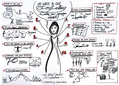
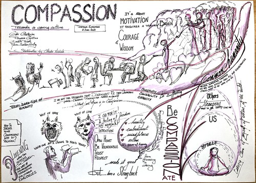
I use Graphic Recording to visually capture live the main message of conferences, meetings, or training. This helps participants to “see” their thoughts, to consider the topic being presented and discussed from another angle, and to better retain information and learning. Depending on the circumstances, I work on a large mural or on flip-charts.

The use of sketchnotes is quite similar to graphic recording in the sense that I also visually capture live what happens during an event. The difference lies in the paper size which is that of my notebook. Here participants don’t see my visuals directly (unless a camera projects my work on a big screen). I also use sketchnotes on many other occasions “just for me”, at work and at home. Whether it’s to organise my thoughts, to sketch a work planning or a process, for a to-do list or a grocery list, to plan my vacation, etc. Anyone can benefit from the practice of sketchnotes, and I guide those who wish during small learning sessions.

Linked data course skecthnotes

Visual communication

I use Visual Communication with hand-drawn illustrations to attract people’s attention incredibly. It gives more impact to your message, which is better understood and memorised by your audience. This is the technique with the lowest involvement level of the participants.

Example of visual communication with the story of the EC’s DG HR represented as a river. The handmade visual supported the Director-General’s speech and captured the attention of her audience.

Visual support to the EC DG HR Away Day

Visuals as a Working tool

On a smaller scale, I use visuals in my daily routine as a working tool to offer more efficiency to my colleagues. It helps to clearly represent complex processes, workflows, etc; to capture, modelize and structure association of ideas, also for problem solving and project management.

What are the benefits of visual thinking?

I’m not going to review the benefits that neuroscience has long proven with hand-drawn visuals. I will simply mention the benefits that come from my direct and personal experience.

Benefits for an individual (at least for me)

  • I grasp complexity better than reading a linear text 
  • It stimulates my imagination and creativity 
  • It helps me better retain information and learning  
  • I am more present and focused 
  • It’s a pathway to heightened my self-awareness, my understanding of others, and have a deeper connection with the world around me. It opens my mind to other perspectives
  • It’s a source of well-being and a meditation channel
  • I have more fun working on serious, tedious, complex topics 

Benefits for a group or a team

  • Visual thinking brings a new energy to the room that boosts collaboration and engagement (people realise this is not an ordinary event) 
  • The large format graphic helps participants to work together more effectively because:
    • they can “see” their ideas and what others are saying too
    • everyone can contribute, feel heard
    • the process and its progress is visible
  • The large format graphic creates also a neutral space that encourages the debate about ideas while it reduces interpersonal conflicts
  • It helps the participants stay focused on the discussion (less distracted)
  • An individual can isolate himself from the group and think in front of the large format graphic
  • It brings more clarity and less ambiguity
  • It generates collective and emotional intelligence by unlocking collective creativity
  • It improves collective understanding of concepts and sharing of agreements. The group can get on the same page 
  • It transcends language barriers, eases conflicts, and dispels misunderstandings
  • It allows to achieve emotional and deeply relevant results
  • The meeting report is created on the go.
    • It will hold the participants accountable for what they have said and decided
    • It will help them to remember and share their work with others 

Benefits for managers and the organisation

  • Visual thinking is a powerful and effective tool 
  • It gives the image of a modern and positive leadership 
  • It contributes to better decision making and better shared decision making, both achieved much more effectively 
  • It enables to tap into the collective, creative and emotional intelligences of a group in order to:
    • Deal with complex issues 
    • Collect information to make informed decisions 
  • Meetings are with fewer interpersonal conflicts and more debate about ideas 
  • It leads to greater buy-in for visions, strategies, actions plans, decisions; to better commitment to these and better appropriation for a sustainable change
  • It generates greater accountability for what is said and decided 
  • It denotes a transparent communication 
  • It materialises the recognition to individual contributions and group consensus 
  • It leads to more motivated teams 
  • It brings fun into otherwise boring jobs, tasks, and meetings

Do you love stories?

A real story of disruptive and unconventional thinking that I told in an interview that is worth reading:

Some years ago, Robert Madelin was appointed  Director-General of DG INFSO and he requested major changes in the way the DG ran its intranet. To explain to him that we didn’t have enough time to apply all of them, given our available resources, I made our case to him with a quickly sketched story on paper, instead of a Powerpoint and Excel figures. Robert accepted our proposition because I was disruptive. I approached him with unconventional thinking. When I went to his office with a drawing, he said, ‘Oh my God, what is that?’ And when he looked closely, it helped him think differently about the problem. This for me was the opportunity to make my case and he accepted my explanation.

More examples

More examples of my work as visual thinker.

What others say about the benefits of visual thinking

For even more resources, please see my collection of books and online resources.

Share on:

Another happy graphic recording at the INFORM-INIO meeting

I was invited once again by my colleagues of DG REGIO, European Commission, to visually record the two-day meeting of the European funds communicators (the so-called INFORM-INIO networks). More than 250 communicators from across Europe gathered in the magnificent Augustinian cloister in Ghent, Belgium, to discuss the future of Cohesion Policy, learn and share the best practices to communicate the benefits of the EU funds to citizens.

Graphic recording of the INFORM-INIO meeting, Ghent, Belgium

I thank my colleagues for inviting me to each of the biannual meetings since 2017.

Since this first time we noticed, in the results of the after-event survey, that the graphic recording has become one of the most appreciated elements by participants. The many positive feedback I receive from them during the two days only confirm these results. It proves to me that hand-made visuals have a noticeable impact on people, combining emotions and information.

That all those who took the time to come and talk to me are also thanked.

See all my photos of the INFORM-INIO meeting and from the previous editions since 2014.

Graphic recording of the INFORM-INIO meeting, Ghent, Belgium
DEC2C3B7-F7B1-41BE-838D-FC77C68946B2


Ghent is “the most beautiful city in the world” said its mayor. Judge by yourself:

Awesome Ghent, Belgium

Read also my post at INFORM-INIO meeting in 2017.

Share on:

EU DataViz 2019

What a great experience it was to be graphic recorder at the “EU interinstitutional workshop on data visualisation” organised by Publications Office of the European Union on 13 November 2019 in Luxembourg. With Célia Pessaud, Catherine Focant, and Vincent Henin, we lively scribed the parallel sessions of the conference.

Graphic recording at EUdataviz 2019

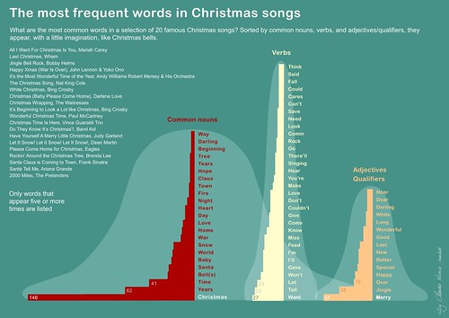
It was exciting to visually scribe workshops and talks on data visualisation. We – graphic recorders and data visualisers – speak the same visual language, use the same visual grammar, rely on the same conviction that visuals are one of the most powerful mean to explain complex ideas. As as said to some speakers:

We find that there are many similarities between our practice of graphic recording and yours of data visualisation. If the raw data that you visualise is often – if not always – numbers, and more and more big data, for us, raw data is what is said and what is happening in the conference room. Both can be complex and be meaningless at first glance. Our common goal is then to make sense with what does not seem to have any, to offer this sense/meaning to our clients so that they can make good use of it, so that they can benefit from this knowledge unveiled with more clarity. One difference that I see between our practices is that while during the process of DataViz there is time to test and adapt the final visualisation (and it’s recommended by the speakers here), in the graphic recording process everything is done live on the spot: listening, then filtering, then summarising, then translation to the visual language. Without opportunity to test and adapt. 

To conclude

There are certainly synergies that can be established between our two communities to learn from each other’s. 

Graphic recording at EUdataviz 2019 Graphic recording at EUdataviz 2019 Graphic recording at EUdataviz 2019 Graphic recording at EUdataviz 2019

The day ended with a fascinating session on how #dataviz helps us to better “see” black holes. Big thanks to Barthélémy von Haller and Jeremi Niedziela from CERN and Oliver James from DNEG. They guided us through this wonderful journey from the smallest elements of quantum physics to the black holes and their representation in the Interstellar movie. Magnificent presentation that shows that synergies between science and art can increase our knowledge about the unknown.

Graphic recording at EUdataviz 2019 Graphic recording at EUdataviz 2019


More information about the conference with all graphic recordings of the team is available on op.europa.eu/en/web/eudataviz/home

Share on:

My Inktober 2019

I decided to go through the 2019 edition of #inktober using just straight lines for my sketches. Oh, you may ask “what is Inktober?” See on the official website what is all about and the prompt list. If you are very curious, you may also want to know why I decided to go with straight lines. This follows a workshop at #ISC19FR with Eva-Lotta Lamm on Freedom on paper, see my related tweet.

https://twitter.com/jihan65/status/1189949261082959873?s=21

All my 2019 sketches, mainly done in the train early morning while commuting to work.

Share on:

A “beautiful” encounter with David McCandless

I had the privilege to meet David McCandless, data journalist and founder of Information is Beautiful, at the European Commission 2019 #EUknowledge week.

David gave the opening keynote speech “Making complex knowledge meaningful – the power of data visualisation”. This is my live sketchnotes of his presentation.

Sketchnotes David McCandless

One of my colleagues summarised his speech as follow:

“We are engulfed in a sea of data. Using graphical images that everybody understands, helps to tell the story behind numbers. […] The story behind data doesn’t lie behind the numbers but in the message that the visualisation brings. […] Visualisation has the power of analysis, it turns data into a landscape that is ready for you to explore […] Data visualisation is like taking a photo, it brings into contrast what is in or out of focus, what is in the background, what is on the forefront. As a data journalist David feels close to photography journalism. You can zoom in or you can go wide to tell your story […] Visualisation unlocks what needs to be known, it gives clarity to big data.  […] To be better understood you convert to a visual language. When you can encode the message in visualisation you bring clarity and there is beauty in clarity. “

I am so happy and honoured that David signed my sketchbook with “Beautiful”. It means a lot to me from the man who wrote “Information is beautiful” and “Knowledge is beautiful“.

Share on:

The power of canvasses for better conversations

On 16/09/2019, more than 300 colleagues from DG REGIO and DG EMPL were in an away-day to reflect on “how to better navigate to the future” for beautiful operational programmes. I was asked to prepare the templates, or canvasses, to harvest the ideas and conclusions from the discussions. There is nothing better than canvasses to put participants in another mental state conducive to better conversations and exchanges.

The power of canvasses The power of canvasses The power of canvasses The power of canvasses

I was not asked for that, but I can not help but capturing the essence of the day with visuals. Inspired by the energy in the room, a tent to be exact, I mixed sketchnotes and scrapbooking.

Graphic recording of the REGIO-EMPL geographical officers away day
Share on: