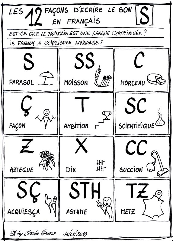
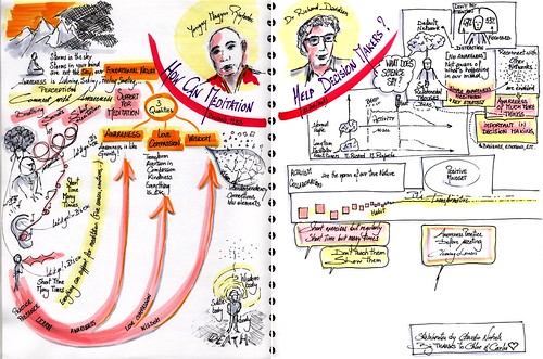
I had the immense privilege of listening to two prestigious experts in their field, with a common research object and practice, meditation. Yongey Mingyur Rinpoche who is a Tibetan Buddhist master and meditation teacher, and Dr Richard Davidson, professor of psychology and psychiatry who is well known for his research on the brain and meditation, and is a friend of the Dalai Lama.
They talked us about meditation, how it can help decision makers. The conference was a pleasant dance between teachings about meditation, small meditation exercises, and scientific facts that confirm the importance of the meditation practice for more awareness for better decision-making. My visual notes:
Big thank you to my colleagues Carles BlasChloé Dengis who invited these two persons and organised the conference so well.
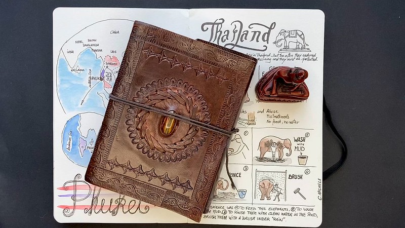
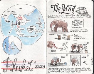
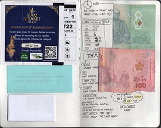
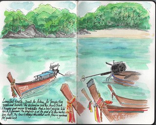
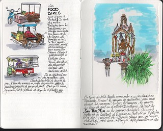
Sketchnotes and drawings from my travelbook during our trip to Phuket in Thailand. Everything was drawn on site even if not always finished or colored at the same time.
This way of collecting moments, places, people, food in a travelbook has become precious to me. Because I take the time to observe, listen, feel before opening my travelbook and drawing. Then because looking at these memories after my return, and even years later, takes me back vividly to the moment I experienced with the same emotions and the same feelings. Much more than photos can do. And I say that as an amateur and fan of photography. Besides, you can look at my photo album of Thailand.
“Each story is like a star. It is bright, shiny and grabs our attention. Stories find their home in narratives, like stars in constellations, and each individual story makes sense and is believable only if it attaches to a narrative. Stories bring narratives to life, while narratives infuse stories with deeper meaning. Taken together, stories and narratives shape our culture.”
I really love this metaphor used by Nayantara Sen and other cultural strategists. I could only sketch it so that it was even more part of me. It gave meaning to a quest I carried out for 10 years. Today it guides me in many work projects and helps me to better understand the societal changes around cultures.
This is the story of how this metaphor came to me. It all started with stardust, with a tagline.
Stardust
Somewhere in 2012, I asked my Director-General “- Walter [Deffaa], how would you explain to your daughter who knows nothing about it, what the Directorate-General for Regional Policy you lead does, in a tagline?”. He slumped in his chair and replied “– Claudio, I’ll never do it. What we do is far too complex to be summed up in a single sentence.“
I remember my confusion. As internal communicator, I was always looking for ways to motivate colleagues in DG Regional Policy, to put stars (12) in their eyes and make them proud of their work. I expected from my Director-General a motto that expresses our purpose and our activities. Something easy to remember, in which each of us could identify, could draw pride and motivation from it. Kind of like the motto a janitor of the NASA space centre gave President JFQ in 1962 “Well, Mr. President, I’m helping put a man on the moon.”
Star
If a tagline is too short to sum up the complexity of what we do, maybe a story would do, I thought. Not only can a story convey information but it does much more than that. A story activates our imagination, involves our senses, triggers our emotions, transmits values and social principles, connects us to identities. Also our brain fundamentally structures and relates our human experiences through stories. That’s why people love and remember stories. As Jung Chang told me in 2013 “- If you tell your message through a story, people will remember your message. Because they will remember the story“.
Convinced of this, I worked for a long time with my colleagues in the communication unit to write the story that tells our organisation, the DG Regional Policy.
The fact is that we never managed to create The perfect story that tells what DG Regional Policy does, and why, in a comprehensive, inspiring, and memorable way. Even just a good story, in my opinion, despite the efforts of my colleagues1 . In my quest, I came to question my idea of one story that would tell everything. And because nothing comes by chance, I watched “The dangers of the single story” TED talk by Chimamanda Ngozi Adichie. I suddenly had the conviction that we were, I was on the wrong track from the beginning. From the TED talk: “I’ve always felt that it is impossible to engage properly with a place or a person without engaging with all of their stories of that place and that person.“, and also “when we realize that there is never a single story about any place, we regain a kind of paradise.“
Constellations
How could one story be the entire story? We had to think of a collection of stories rather than a single story. Not only did we have to tell stories, lots of stories, but above all not to create them ourselves, we the communication experts. These stories had to be told by those who lived them, by the protagonists.
This is how we, Eva Maria S. and I, created the “Our stories” internal video series, the first narrative. Within two years, we interviewed more than 130 colleagues. We asked them to tell us their little big stories of what they do in their work, which we filmed and published internally. The series was a source of inspiration and motivation for all staff to do more, to do things differently, with joy and together. The series made it possible to understand the narrative of what we were doing and how, but it still lacked the narrative of why we were doing it, the meaning.
With Agnès M., I then imagined a new collection of stories, for another narrative. “An aggregate of similar stories that produces a meaning-making pattern” to better understand who we are, and why we do what we do. It was time to leave our walls and our colleagues to go to the field to collect other stories. The little big stories of the beneficiaries of the European funds for which we worked. As I explained to my colleagues in the vision paper for the launch of the series in 2019 “this collection of stories constitutes the compelling narrative that will broaden our spectrum of vision to the meaning of what we all do together for the ultimate benefit of the citizens of Europe.” You can watch and listen to these little big stories on Youtube in the “Stories from the regions” playlist.
Galaxies
With great humility, I don’t believe that these constellations of stories have brought about any cultural change in DG Regional Policy. That was not the objective. At most, the colleagues who have taken the trouble to listen to the stories hopefully better understand the deeper meaning of their daily work, as well as the culture of our organisation. That was the objective.
According to Nayantara Sen in Stories for change: “to transform our culture, we begin by changing the stories that we tell. Because each story has the power to shift narratives, and by extension, change belief systems in our culture“. The objective was not to change our culture in DG Regional Policy, so we collected and told the stories that supported our current narratives. To instill a culture change in the organisation – useful for any organisation that wants to evolve and adapt – it would take humility and audacity to collect other stories, to use other storytelling models, in order to shift the current commonly accepted narratives. This is the biggest lesson I learned on my journey from stardust (a tagline) to galaxies (cultures).
Footnote
My colleagues in the communication unit of DG Regional Policy continued the reflection and came up with this motto that you can read on the Regional Policy website: “Regional policy is the EU’s main investment policy. It supports job creation, competitiveness, economic growth, improved quality of life and sustainable development, leaving no one and no region behind.” Well, my former Director-General, Walter Deffaa, was right in 2012. It’s impossible to sum up the complexity of who we are and what we do in a single sentence, however elegant and punchy it may be.
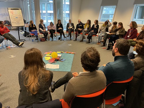
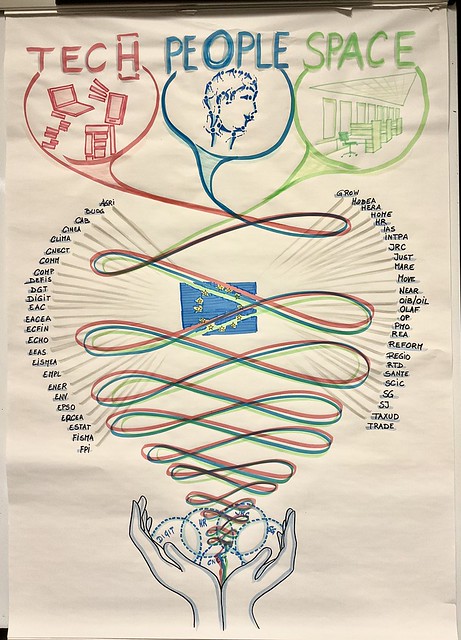
To better support the change in the ways of working within the European Commission, a group of colleagues from different teams have decided to join forces in a collective. The idea is to bring together within the same entity all the existing teams which support, facilitate, advise on change, whether they come from the field of HR, organisational development, coaching, consulting, IT, science, governance, data and knowledge management, facilitation, etc. A few days ago, 40+ members of these teams came together for the first time. I had the privilege of being part of these colleagues as a participant and as a host with Ildikó Faber, Mira Bangel, Snezha Kazakova, Fania Pallikarakis, Antonella Tarallo, and Suvi.
One of my roles was to bring visual thinking to the day’s sessions. To help get to know each other better, a session was about creating a competencies visual map. I proposed to colleagues to use wool threads to link their name to competencies, teams and entities on a large board. The session was very dynamic and the result very visual.
To create a common understanding of the mandate of the new entity, we used an hand-made illustration of its 3 pillars. During the session, it was easier for my colleagues speakers to support their explanations and stories with the illustration, while the participants could more easily understand what was presented.
Visual thinking is a work tool that is increasingly used at the European Commission. A tool for making sense, which helps to clarify ideas, to better understand and remember.
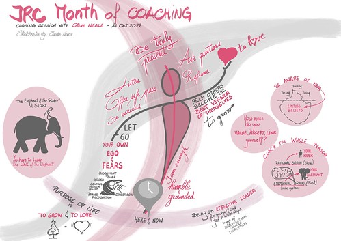
The JRC Month of Coaching ended with an inspiring talk by Steve Neale, from the Limbic Performance System. As usual, I took visual notes to remind myself of Steve’s main messages. At the same time and without us concerted, my colleague Alexandra Balahur took written notes and wrote a superb article.
With her permission, I publish below our two summaries of the same talk. As further proof that words and visuals are complementary. They support each other to allow readers to have a deeper understanding of the subject by using more cognitive functions.
The Alexandra’s article (originally published on an internal platform of the EC) and below my sketchnotes:
One universal choice
All choices we make boil down to only one: the choice between love and fear. Love is coming back to the birthplace of “I am enough”, of self-worth, of “I value, accept and like myself fully” (in full awareness of all my good and my less good), while fear is the opposite of all that – questioning one’s self worth, comparing oneself with others, judging oneself and others, always feeling “not enough”. Love makes good leaders and coaches, fear is a sign that EGO and its never fully met needs are standing in the way of our reaching our highest potential. Limiting beliefs, past negative experience – learned or lived -, conditioning become the interference from “enough” to “not enough”. This was the powerful message that closed the JRC Month of Coaching in an inspiring talk delivered by Steve Neale.
The Rider and their Elephant
As a Psychologist, Executive Coach, Hypnotherapist, NLP Practitioner, Psychodynamic Therapist and International Author & Speaker, Steve Neale is the Creator of the Limbic Performance System for Outstanding Leadership and Teams and the author of the Emotional Intelligence Coaching book that inspires leadership coaches and leaders worldwide. The metaphor he uses at the basis of EI Coaching – that of the rider and the elephant, signifies the relationship between our rational ‘brain’ and our emotional ‘brain’. Coaching is seen as a process of aligning the two – the rider and the elephant – by gaining awareness of the interactions between our thoughts, feelings and actions and how these interactions lead to our behaviour and eventually performance.
What makes a good leader is the same as what makes a good coach
Steve’s closing talk focused on leadership and coaching – how to be or become a good leader and a good coach. In his view, reaching our own highest potential is becoming an effective leader of ourselves and our relationships. According to our speaker, being a good leader implies: First: Getting over your own ego and returning to your birth place of “I am enough” (Awareness of your ego and its never met needs) Then: Helping others become the best version of themselves
How to help others become the best versions of themselves? Leader vs. Coach
In a similar way as a coach supports a coachee in the journey to becoming the best version of themselves, leaders support those in their team do the same. According to Steve Neale, both achieve this by being truly present, using full spectrum listening (intuitive and emotional), asking great, challenging and growth-focused questions, reframing situations, giving the person in front a safe space to be heard, felt, not judged and to grow. And this can only be done if their own EGO does not stand in the way – i.e., judging (good or bad), needing to “fix”, needing to help, not being present for the other, leading with questions to a specific answer, comparing themselves with the other, wanting power, praise or recognition. In a nutshell, by choosing love over fear and supporting the person in front to do the same.
“Know Thyself”
The only choice we ever make is between love and fear, but each and every one of us is different and thus what the choice will look like in practice is different, as well. Understanding our full potential and eliminating our fears requires gaining knowledge and awareness about ourselves: our values, needs, emotions, our thoughts and thought processes, our beliefs – both positive and limiting, our fears and what lies beneath them, etc. Coaching is about this process of gaining self-knowledge and self-understanding, empowering us to choose love – i.e. make choices that are truly in alignment with who we are, what we stand for and what we believe in, beyond fear (of not being enough, of being less than X, of what others will say or think, etc.). What does that look like in practice? Here are five sentences Steve Neale proposed in his talk.
When I have a healthy respect for myself I….
When I feel really good about who I am I…
When I know and value my own worth I…
When I feel attractive and at ease with my look and body I…
When I don’t worry about what others think of me I…
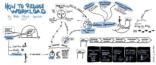
Who has never wondered how to reduce their workload? But who has never found a solution to the question, which is not episodic or ridiculous in terms of real benefits?
My colleague Oliver Kozak brought his scientific and systemic approach to present how continuous improvement can help us to really reduce worlkload.
The objective is to free up enough time to be able to start improving, in order to free up even more time up to 40% to be able to improve continuously and ultimately create much more value at work (by moving from the Spend-It-All team model to the Time-Investor team model). How to get there concretely? By improving in three areas: (your) work processes, team efficiency, and organisation development. Important: you have to go slowly, step by step, with persistence day after day, be patient, and get support.