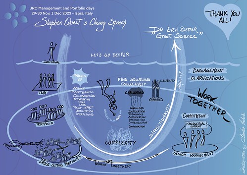
Developing a community of practice is both an art and a challenge. Growing it dynamically and organically, keeping it vibrant, and ensuring it thrives requires specific actions, continuous energy, and unwavering dedication at every stage of its life cycle. While elements like clear purpose, committed sponsorship, strong governance, and an engaged core team can lay a solid foundation, what truly drives a community forward is the passion of its members for their craft.
The HR professionals’ community of the EU institutions exemplifies this beautifully. Through their commitment, energy, and collaboration, they have created a space that feels alive, which is warm and dynamic. I have the privilege of following this community closely, through my normal job but also through my activities as a visual thinker within the EU institutions.
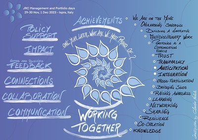
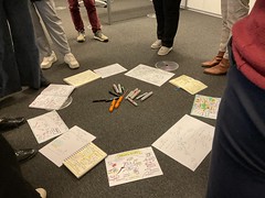
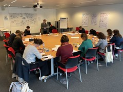
Recently, they invited me for the graphic recording of their meetup and to facilitate a Knowledge Café. The focus of the Meetup was on “trends in the world of Human Resources”.
What stood out to me was not only the relevance of the topic but also the enthusiasm, goodwill, and deep engagement of the members in the room and online, extending even to other EU bodies. Their passion for the discipline of HR is truly inspiring.
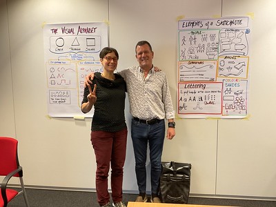
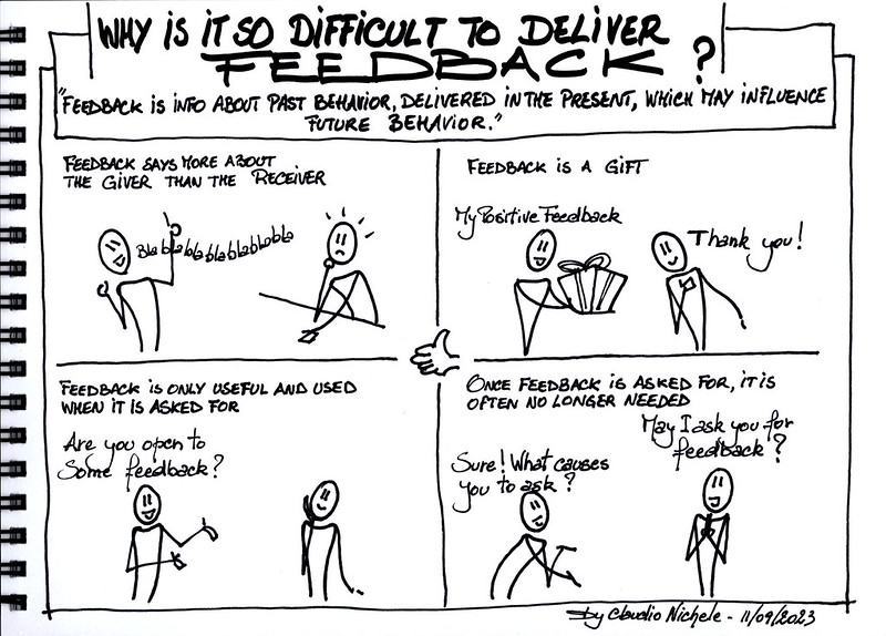
This event was particularly special for me because I wasn’t working alone. I had the joy of being joined by two talented colleagues from my own community of sketchnoters, @reiter_petra and Sara Serrano Perez . After attending the sketchnoting training I provide within the institutions with Celia Pessaud , they accepted my invitation to join me for their very first live sketchnoting experience. Their work was remarkable, especially for beginners, and gives me so much hope for the future of visual thinking in our institutions. Seeing their joy and pride in their work warmed my heart and reinforced my belief in the power of communities to nurture and inspire.
The EU institutions are evolving and innovating, often more than it seems from the outside. Vibrant communities of practice, paired with an increasing number of colleagues embracing visual thinking, are at the heart of this transformation. I’m grateful to witness and contribute to this journey.