Coronavirus en Belgique: confinements et déconfinements

Quand j’ai écrit cet article en avril 2020, je voulais expliquer simplement les phases du déconfinement avec mes sketchnotes, et décrire sur une ligne du temps comment la Belgique en était arrivée à devoir confiner sa population pour contrer la pandémie du COVID-19. Comme tout le monde, j’avais alors l’espoir qu’avec la fin du déconfinement prévu pour septembre 2020, on en aurait fini avec cette période. Le cours des événements a été fort différent et j’ai été contraint de mettre à jour ma ligne du temps.

23/10/2020: Je dois mettre le titre de cet article au pluriel car la Belgique est maintenant touchée par une deuxième vague importante de cas COVID-19. Des mesures à nouveau strictes remettent le pays dans une situation similaire au premier confinement, après une phase de déconfinement et… de relachement.

27/07/2020: Après les phases de déconfinement compliquées à comprendre mais qui ont donné de l’espoir, la Belgique durci ses mesures en raison de l’augmentation inquiétante du nombre de cas de Covid19.

24/04/2020 (article original):

Le 24 avril, le gouvernement belge annonce sa stratégie de sortie de crise coronavirus. Le temps du confinement dû à la pandémie touche à sa fin, ou pour le moins c’est que l’on espère. Le conditionnel reste toujours de mise car comme l’a dit Madame Sophie Wilmes, première ministre, lors de sa conférence de presse: “

Le déconfinement est une opération jamais réalisée dans l’histoire de notre pays et dépend de l’évolution de la situation sanitaire et se base sur des hypothèses et des prévisions. […] Rien n’est gravé dans le marbre et certainement pas les échéances.”  Les faits lui ont malheureusement donné raison.

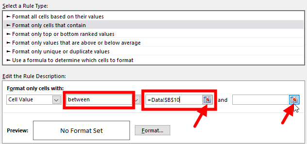
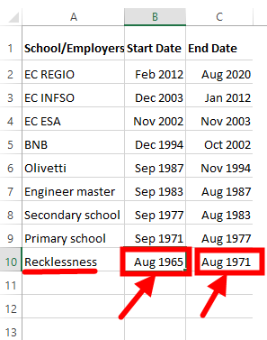
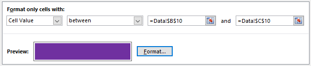
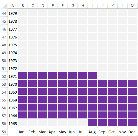
Le moins que l’on puisse dire c’est que le déroulement de la sortie de crise annoncée en 4 phases apparait compliqué et peu clair. Comme quoi, la communication de crise est une tâche très difficile. Pour mieux m’y retrouver, j’ai visualisé sur une ligne du temps les différentes phases de sortie, avec ce qui s’était passé depuis le début de la crise (et les événéments qui ont suivi). J’ai ajouté quelques sketchnotes persos sur la ligne du temps pour faciliter la compréhension de ce qui est à nouveau autorisé, ou interdit.

Ligne du temps de la crise du coronavirus/COVID-19 en Belgique

Share on:

How to create a visual CV with Excel

Updated on 1st of March 2022

Read my Linkedin post.

Updated version of my visual CV

Original post

Recently I posted on social media a visualisation of my CV based on my LinkedIn data. I enriched it with my practice of visual thinking and my main job experience.

The original image is on Flickr.

I explain here how you can do the same and create your own visual CV using Excel only (Microsoft Excel 2016). If I used Adobe Photoshop to add the fades in the 2nd and 3rd graphics, you don’t need it for the basic version of the 3 graphics. You don’t have to be an expert in Excel either, a low-medium level is sufficient.

How to create a visual CV step-by-step:

  • Start with a new blank workbook
  • Create a table with the start/end dates of the different periods of your professional life that you want to visualise. Rename this sheet to “Data”. I customised the cell format of my dates with the custom type “mmm yyyy”. Up to you to use any other date format, it has no influence on the following. Note that I decided to start the list with my birthdate, which makes my data more complete than what is displayed on Linkedin. It’s up to you what data you want to see in your visual CV.
  • Create a new sheet that you rename to “Viz” for your visualisation.
  • Reserve its first line for your title and any other information you want to add. Create a matrix with the months of the year on an horizontal line and a top-down list with all years you want to use in the first column. In my case the list goes from 2020 to 1965. You can duplicate the line with the name of the months at the bottom of the matrix if your list of years is long (like mine).
  • Fill in the first 4 cells of the matrix with the corresponding dates. Then drag the fill handle to fill the remaining cells of the matrix with their date (from January of the year in the top-left cell to December of the last year in the bottom-right cell)
  • Select all your data. Select the “Format” option in the horizontal navigation menu and set the value of Row height to 20 and the value of Column Width to 4. In my case, these values resize the cells into a nice shape.
  • Select again all your data. Right-click them and select the “Format cells…” option. In the “Fill” tab, set the Background Color to white. All gray cell borders are gone.
  • Select the dates into the matrix only. The row(s) with the name of the months and the column with the years are not part of your selection. Right-click it and select the “Format cells…” option. In the “Border” tab, select the thick style line; change its Color to White; and tick the Outline and Inside options to apply these changes to the selected cells. Don’t press now the “OK” button or come back to the “Format cells…” option.
  • Within the “Format cells…” option, go to the “Font” tab. Select a light gray for the font Color. Then go to the “Fill” tab and select the same light gray for the Background Color. Confirm your changes with the “OK” button. If everything went well, your matrix should consist of gray cells with white borders. Something like this:
  • You have a nice matrix with all years of your professional life represented with a gray box for each month. You will now color each month with a different color according to the different periods of your professional life. You can do it by hand (like I did the very first time), or use the Conditional Formatting feature to change automatically the color of your cells based on the start/end dates you entered in the “Data” sheet.
  • Select the matrix of gray cells only.
  • In the horizontal navigation menu, choose “Conditional Formatting” and the Manage Rules… option
  • Click the “New Rule” button and select “Format only cells that contain”
  • Set the condition to format the cells of the matrix with your first professional period. In my case, it’s what I called Recklessness. The condition will select the cells “between” the start date of my Recklessness (= cell Data!$B$10) and its end date (= cell Data!$C$10). You do that with a click on the icons on the right of the field; here indicated by the red arrows, then go to the “Data” sheet to select the related cells.
  • Then click the “Format” button to choose what color to apply when this condition is met. In the “Fill” tab, set the Background Color to the desired colour. In the “Font” tab, set the font Color to the same as the background. My condition looks like that:
  • Confirm this condition by clicking the “OK” button, and apply it to the matrix cells with the other “OK” button. Cells corresponding to my period of Recklessness are now colorised in a dark violet.
  • Reselect your matrix of cells and redo the same steps to create a new condition for your second period: From the horizontal navigation menu, choose again the “Conditional Formatting” and the Manage Rules… option. Click New Rule… and select “Format only cells that contain”. Select the start and end dates of your second period and select a new color for the font and the background. In my case it’s the Primary School period that starts in Sep 1971 and ends in Aug 1977. I decided to format the corresponding period with dark ochre color.
  • Repeat these steps for all periods of your professional life. At the end, you have as many conditions as there are periods. And all periods of your professional life are now with different colors.
  • Add a title on the first row and any other details you want to display in a footer. Add the name of the period on the right of the related year, maybe using the same color as the period. Don’t forget to set the background color for these cells to white.
  • Excel does not allow to save your final work in image format. You need another program like Microsoft paint or Adobe Photoshop, or any other application for images.
  • Select all the cells with the visualisation of your CV. Copy them, Ctrl-C, and paste them, Ctrl-V, in your favorite application for images . Save to an image. That’s all.
  • To add other graphs on the right of this one, like I did with my practice of visual thinking and my main job experience, you should
    • add your new data in the “Data” sheet
    • go again through all steps to create a new graph and to colorise it, being smart in managing the matrix with the dates.

I look forward to seeing your results, feel free to share them with me.

Share on:

Visualisation of the 2017 #EURegionsWeek on Twitter

My original Visualisation of #EURegionsWeek 2017 on Twitter article is now  published on the Regional Studies, Regional Science open access journal.

It gives me a sense of pride that @RSRS_OA asked me to publish my data visualisation in their journal. I’d like to thank them very much for giving me this opportunity.

As so often with me, I started this project as an experiment. Little by little I worked on the data and, after a lot of tests, I finally arrive at this beautiful visualization. I anticipated that there was more to say, then I continued my investigation to conclude the article with the influencers.

I acknowledge that being published on the Regional Studies, Regional Science journal is a nice recognition. Nevertheless, I still prefer my original article where I allow my visitors to interact with the graph and with data. And as a bonus, I also give them some background information about the methodology and the used tools.


Share on: