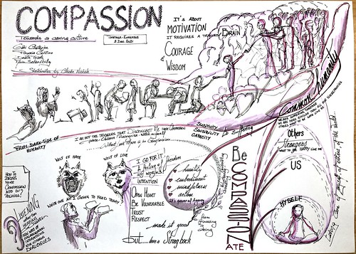
Compassion requires motivation, courage and wisdom.
It’s about humility, mindfulness, embodiment and taking action. There is no compassion without love. Bringing compassion in the EU policy-making process will lead to other ways of actively listening to citizens, interacting, co-creating and collaborating with them.
My #inktober2021 prompts in an inception video mode. Drawn with fingers and ink on Procreate iPad, mounted on Adobe Premiere, everything quickly.
To say that I didn’t even want to do this Inktober challenge because I was too busy this month with other professional and private commitments. Then I told myself to illustrate the prompt of the day without pressure, just by following my instinct, by drawing with my fingers and a single brush in black ink (membrane) on Procreate / iPad, all quickly. And to facilitate my life, or complicate it depending on the point of view, each day create a new prompt from the previous one.
Finding inspiration quickly for a concept, an idea, a word, is the constant challenge of the graphic recorder/facilitator. Sometimes it helps not to think too much and to connect to his inner creativity. This Inktober challenge helped me put this principle into practice. This is the result with all 31 prompts animated in a “inception-mode” video (mounted quickly on Adobe Premiere). Big thank you to friends who encouraged me, especially friends and members of the sketchnote community.
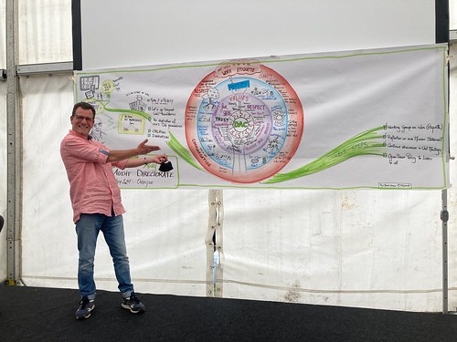
It all started with an empty sheet on the wall, then members of a fresh new directorate started to reflect on their values, identity and how they will work together in the new normal, the so called new ways of working.
The closing of the day was done by their director in front of my graphic recording. Before that moment, he and I spent some time together reflecting on the outcomes of the day watching the graphic recording.
This is why #iLoveMyJob so much as graphic recorder; when my job helps a leader to have more clarity on many inputs and for a group of people to “see” on a page what they said, discussed, reflected on.
In the article that I co-wrote with my colleague and manager Agnès Monfret, we explain how we adapted our way of communicating internally and externally when the pandemic hit our habits, our ways of working and thinking.
Once again, the use of handmade drawings greatly supported the messages, and brought that touch of humanity necessary in a world of communication and collaboration that has become entirely digital.
The original article was published on TerritoriALL, the EPSON magazine (page66). Thank you Agnès for this collaboration and for the work done together.
17/11/2020 – La deuxième vague de contaminations au virus COVID-19 en Belgique a atteint son apogée, enfin, et les différents indicateurs sont tous à la baisse. Il faut espérer que cette inversion de tendance se poursuive.
Les données du site sciensano.be[1] montrent que la deuxième vague a atteint des pics plus élevés que la première du printemps 2020. Les personnes admises à l’hôpital pour cause de COVID-19 par jour ainsi que les patients en soins intensifs ont été plus nombreux, mais heureusement il y a eu moins de décès par jour.
La décroissance est certainement attribuable aux changements de comportement des personnes en société, en famille, au travail; changements qui ont été eux-mêmes influencés/imposés par les mesures prises par les dirigeants politiques [2]. Ce sont les décisions politiques, comme celle de mettre la population en confinement, qui conditionnent le plus nos comportements et nos agissements quotidiens, bien plus que tout autre facteur (la connaissance, les croyances, les relations,…). C’est pourquoi je me suis posé la question est-ce que nos dirigeants ont pris les bonnes décisions au bon moment pour tenter de contenir la deuxième vague?
Intuitivement, je pense que nos dirigeants n’ont pas pris les décisions au bon moment avant et pendant la deuxième vague, et que des morts auraient pu être évités. Pour confirmer ou pas mon intuition, j’ai décidé de comparer les deux vagues et de coller dessus le moment où les importantes décisions politiques ont été prises.
Les décisions politiques
D’abord, le système décisionnel pour tout ce qui touche à la santé est compliqué en Belgique, très compliqué. Les compétences de santé y sont éclatées entre les différents ministres des gouvernements du fédéral, des régions et/ou communautés. Ce que l’on appelle la lasagne institutionnelle belge est en fait un spaghetti (un foutoir?). J’ai tenté de l’illustrer sans y parvenir:
Les différents gouvernements ont pris des mesures chacun à leur tour et ont donné autant de conférences de presse pour les communiquer. C’est ainsi qu’on a eu droit à un triste festival de conférences de presse au mois d’octobre: d’abord le gouvernement fédéral avec un renforcement des mesures le 6/10, puis des mesures plus dures le 16/10, puis des mesures encore plus strictes le 23/10 au matin, les gouvernements de Wallonie et de la Fédération Wallonie-Bruxelles adoptent des mesures plus strictes ce même 23/10 après-midi, la région de Bruxelles prend ses mesures un jour après le 24/10, le gouvernement flamand adopte ses mesures le 27/10, et finalement le gouvernement fédéral décrète le deuxième confinement le 28/10. Le manque de coordination a été… flagrant. Cela est venu s’ajouter à une communication souvent confuse. Un problème rencontré depuis la première vague, avec par exemple le port du masque conseillé, puis rendu obligatoire, pas partout ici mais partout la-bas, tout le temps ou à certains moments selon la région, puis à nouveau conseillé puis à nouveau obligatoire selon la région. Même chose pour les cours à distance dans l’enseignement, la fermeture des commerces, les horaires du couvre-feu, etc.
J’ai placé les événements principaux qui se sont succédés en Belgique sur une ligne du temps (impossible de tous les mettre, mais indiquez-moi si quelque chose d’important manque):
Les deux vagues
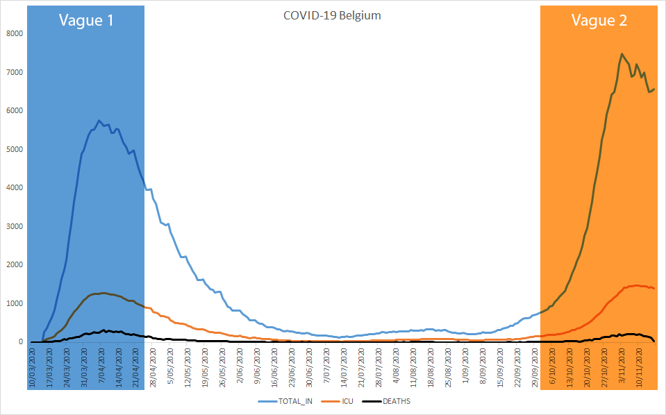
Pour comparer les deux vagues, je me suis limité à 3 indicateurs journaliers avec 1) le nombre d’admissions à l’hôpital, 2) le nombre de patients en soins intensifs, et 3) le nombre de morts. Ce sont les seuls indicateurs qui soient assez comparables entre les deux vagues. Les autres indicateurs comme le nombre de cas et celui des tests effectués ont trop changé au cours du temps selon la stratégie de testing adoptée.
Dans le graphique ci-dessous, la vague du printemps 2020 est encadrée en bleu et la vague de l’automne 2020 en orange:
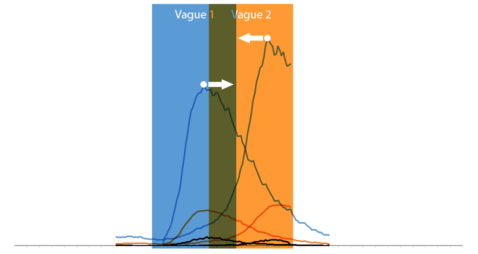
J’ai ensuite rapproché les courbes en les faisant glisser sur l’axe horizontal jusqu’à ce que leurs sommets (= la valeur max de chaque vague) tombent le même jour:
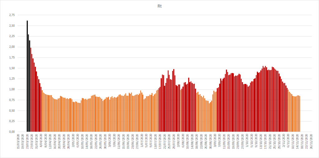
J’ai aussi ajouté le taux de reproduction, Rt (ou R0), sous les graphiques des 3 indicateurs. Sur la ligne du temps ci-dessous, la couleur orange (la plus claire) indique un Rt inférieur à 1, la couleur rouge indique un Rt supérieur à 1, la couleur noire (la plus foncée) indique un Rt supérieur à 2. J’ai utilisé la tonalité, de clair à foncé, pour le RT dans les graphiques de comparaison des courbes.
Comparaison des deux vagues
Voici les visualisations qui comparent les deux vagues de printemps et de l’automne 2020 pour 1) le nombre d’admissions à l’hôpital, 2) le nombre de patients en soins intensifs, et 3) le nombre de morts. Les courbes ont leurs sommets alignés sur le même jour et les décisions de mesures importantes sont situées à leur date respective selon la vague.
1. Comparaison des admissions à l’hôpital
Cliquez l’image pour pouvoir l’agrandir ou la décharger à partir de ma gallerie Flickr.
2. Comparaison des patients en soins intensifs
Cliquez l’image pour pouvoir l’agrandir ou la décharger à partir de ma gallerie Flickr.
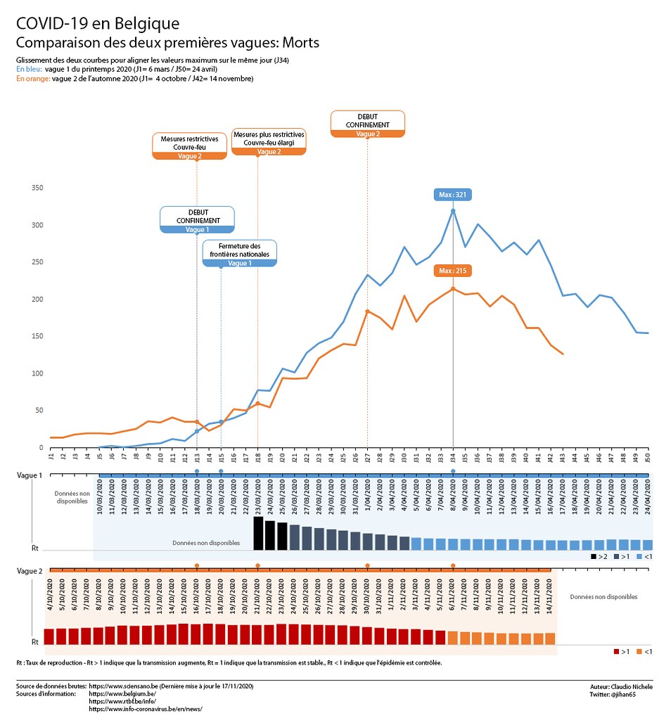
3. Comparaison des morts
Cliquez l’image pour pouvoir l’agrandir ou la décharger à partir de ma gallerie Flickr.
Conclusions (qui n’engagent que moi):
Je dis BRAVO, chapeau bas, respect, au personnel médical en hôpital, aux professionnels de la santé et au personnel des maisons de repos. Moins de personnes sont décédées par jour grâce à eux lors de la deuxième vague. Ils l’ont fait malgré la fatigue, le stress, la peur, et le manque de resources, alors qu’ils ont eu plus de patients à traiter que pendant la première vague. Je ne suis pas expert, mais mon explication simpliste est qu’ils ont appris les leçons de la première vague. Ils ont développé et amélioré leurs protocoles afin de mieux combattre le virus. Merci infiniment à Vous tous!
Je ne dis PAS BRAVO au monde politique belge. Ni à l’actuel qui a dû gérer la crise sanitaire, ni aux précédentes générations de politiciens qui nous ont légué ce système institutionnel et décisionnel. La complexité du système a donné lieu à une belle cacophonie pour communiquer les décisions anti-covid.
« il manque des structures claires [dans le système de santé belge] où on sait qui est responsable pour quoi. Le système belge a aussi contribué à la 2ème vague. » – JanDeMaessener, Professeur émérite de médecine de famille à l’université de Gand [3].
Sans parler de la communication confuse des mesures lors de certaines conférences de presse. Cela a non seulement contribué à éroder l’adhésion de la population aux mesures [4] mais cela a aussi augmenté la défiance à l’égard des institutions et alimenté la propagation des théories conspirationnistes [5]. Mais les décisions ont-elles été prises au moment opportun, au moins cela, pour freiner la montée des courbes? Surtout lors de la deuxième vague de l’automne? Le doute est permis quand on compare les deux vagues.
A la première vague du printemps, le virus nous a touché presque par surprise. L’inconnu et l’incertitude étaient totals et le monde politique et surtout médical ont du réagir en mode gestion de crise. Rétrospectivement, on constate que le premier confinement de la Belgique a été décidé tôt par rapport aux sommets de la vague, alors que les chiffres étaient encore relativement bas.
Après la première vague, les scientifiques ont alerté le monde politique et nous les citoyens qu’une deuxième vague allait arriver. Forts de l’expérience de la première, on aurait pu s’attendre à ne plus être pris par surprise, ni de devoir réagir en mode gestion de crise, et qu’une stratégie allait être mise en place par le politique pour mieux anticiper. Non seulement ce ne fut pas le cas, mais la situation dans les hôpitaux a été pire! Rétrospectivement, on constate que le deuxième confinement de la Belgique a été décidé très tard par rapport aux sommets de la vague, alors que les chiffres étaient déjà relativement hauts, déjà plus hauts que ceux de la première vague (sauf pour le nombre de décès qui est heureusement resté inférieur, les politiciens n’en ont pas le mérite). Même les mesures restrictives prises avant le deuxième confinement l’ont été quand les chiffres étaient déjà bien supérieurs à ceux de la première vague.
L’évolution du taux de reproduction Rt confirme également le retard des décisions qui auraient pu le faire baisser pendant la deuxième vague. La comparaison des deux vagues montre qu’il est repassé sous la valeur de 1 plus rapidement pendant la première vague que dans la deuxième alors qu’il partait de valeurs supérieures à 2.
Sources d’information:
Les datasets COVID-19 de Sciensano, l’institut scientifique de référence en épidémiologie des maladies infectieuses en Belgique: https://epistat.wiv-isp.be/covid/
On 5 May, Amy Lenzo (*) gave an online masterclass on “Hosting and harvesting online VS physical” to the community of practitioners of the Art of Hosting at the European Commission (**). My takeaways (actually apply to any online session):
“It’s not a question of technology, it’s a question of relationships”
90% of your experience, skills, practice as organiser of physical events can be transposed into online events. Reassuring, isn’t it?
The quality of your presence, trust and how you hold space, are just as important online as in the physical world
Never host alone an online session, be part of an hosting team
The hosting team must consist of at least one process host and one tech host (for all technical aspects) or more for large groups
The use of the camera is mandatory for speakers, and highly recommended for all participants (with muted mikes)
To keep participants’ attention, speakers can only use the visible/audible part of their body language: their face and their voice. Then, it’s crucial to smile with the whole face and to have a catchy tone and rhythm of voice
Keep in mind that everything is amplified online: your voice, your unconscious bias, space and time.
This was also my first live graphic recording using the Procreate app (***). Only a few days after installing it on my tablet (it’s crazy, I know, but I like these challenges). My first learnings to start with Procreate:
Many years of experience with layers on Photoshop has helped me a lot. If you’re not familiar with layers, take time to learn how they work and to play with them
Select your fave brushes in advance. You can waste precious time looking for what you need during a live event. Mine were Technical pen, Acrylic and Wet Acrylic, and Hard Airbrush (I still have to learn how to have them available in one click)
Select your fave colours in advance for the same reason as for the tools (I still have to learn how to create my colour palette in advance)