Graphic recording of the JRC senior management seminar

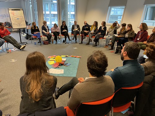
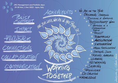
As member of the JRC and as visual thinker, I was invited to capture visually the main insights of the JRC senior management seminar. During two days, I listened to a few hundred managers taking stock after one year of the launch of an innovative way of working in transversal modes in our organisation, the so-called JRC portfolios. The program was a fair balance between keynotes, informative presentations, exchanges, and conversations in world café mode. My challenge was to create the graphic recording of all this in order to provide a visual but also emotional memory that would be useful to the participants and those who were not present.

Graphic recording of the JRC senior management seminar

On the substance

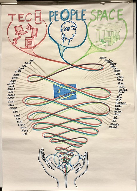
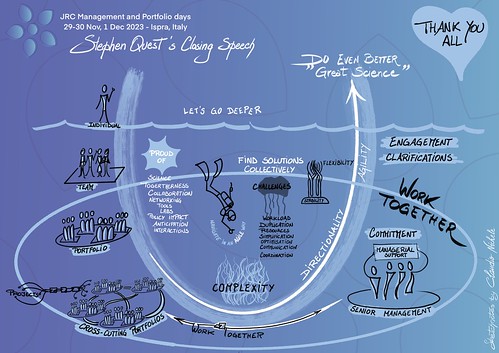
Overall, the results after one year are positive. There is a deeper understanding among the managers of the benefits of collaborating and working together on cross-cutting themes to “do even better science to support EU policies”. There are of course issues to resolve, while navigating a complex organisation and world, but by working together, everyone agreed that we would be able to overcome it all.

Graphic recording of the JRC senior management seminar

How I worked

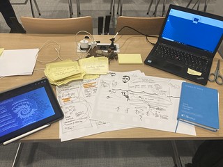
Aware that I would not have been able to capture the essence of extremely technical, dense and tense conversations over two days, I put together a small team of volunteers to help me. They were instructed to write down points and insights that were important to them on post-its (when they wanted and if they could) and bring them to me. This is how dozens of post-its arrived at me at the end of each intervention. Thanks to them I was able to refine my live visual notes by confirming or correcting my own notes, or by covering what I had missed.

Graphic recording of the JRC senior management seminar Graphic recording of the JRC senior management seminar

Personal take-aways

The intensity of the program spread over three days, and the exhausting trips to and from the hotel which was very far away, should not have impacted my concentration and my ability to listen. So I relied on a few small moments of meditation during the days, whether it’s a walk outside the conference center or stacking stones in balance inside. This is really what allowed me to keep my concentration and manage my mental fatigue.

Graphic recording of the JRC senior management seminar

I was moved when some of the colleagues who helped me with the harvesting said at the end that they had listened to the speeches with much deeper attention than usual. They experienced the basics of harvesting, this technique in the art of hosting which first consists of listening at different levels. Without them I would not have been able to create such rich and deep visual notes. Harvesting important events can only be done correctly with and as a team.

I want to express them my gratitude and to the other colleagues with whom I had the privilege of working closely, for their support, their help, their kindness, for the coffees brought, their smiles, for their comforting looks, for who they are. Beautiful people.

Graphic recording of the JRC senior management seminar Graphic recording of the JRC senior management seminar Graphic recording of the JRC senior management seminar Graphic recording of the JRC senior management seminar

This blog post is available on Linkedin as well

Share on:

Visual thinking at the service of the collective and its intelligence

To better support the change in the ways of working within the European Commission, a group of colleagues from different teams have decided to join forces in a collective. The idea is to bring together within the same entity all the existing teams which support, facilitate, advise on change, whether they come from the field of HR, organisational development, coaching, consulting, IT, science, governance, data and knowledge management, facilitation, etc. A few days ago, 40+ members of these teams came together for the first time. I had the privilege of being part of these colleagues as a participant and as a host with Ildikó Faber, Mira BangelSnezha KazakovaFania PallikarakisAntonella Tarallo, and Suvi.

One of my roles was to bring visual thinking to the day’s sessions. To help get to know each other better, a session was about creating a competencies visual map. I proposed to colleagues to use wool threads to link their name to competencies, teams and entities on a large board. The session was very dynamic and the result very visual.

To create a common understanding of the mandate of the new entity, we used an hand-made illustration of its 3 pillars. During the session, it was easier for my colleagues speakers to support their explanations and stories with the illustration, while the participants could more easily understand what was presented.

Visual thinking at the service of the collective

Visual thinking is a work tool that is increasingly used at the European Commission. A tool for making sense, which helps to clarify ideas, to better understand and remember.

This post is available as a LinkedIn article also.

Share on:

Visuals bring clarity about the complexity

My takeaway from conversations that I captured visually

Our brain has great difficulty understanding a complex system with only words. A visual can bring clarity about the complexity and eventually show that what appears to be complex is just complicated.

Over 200 colleagues from across the JRC, the European Commission’s science and knowledge department, met for the launch of their future new transversal working structures, the JRC scientific portfolios. The goal was to engage and discuss around the journey they are about to embark upon together. As with any departure, there was excitement but also some fear sometimes in the face of the unknown.

During a large World Café exercise, colleagues discussed the many outstanding issues, roles and responsibilities, collaboration, resources, to name but a few. At the end, each conversation table shared their main conclusions with everyone. The large number of points, open questions, as well as the numerous interlinkages, made it difficult not to qualify the portfolios system as complex.

My task was to take visual notes of the conclusions, the typical graphic harvesting of a World Café. Because it was too much, too dense and fast, I just noted on post-its the key words and few arrows. Afterwards I put on a large paper a first draft of all of that. Only then did I reorder the points and the connections to create a mind-map on my iPad.

In his report after the event in which he used my visuals, Stephen Quest, the JRC Director-General, said “the portfolios must not become another layer of complexity. Rather, we need to use them to help navigate our complexity.” I am happy and proud to have been able to bring clarity to this apparent complexity with my visual, and I hope I have reduced it to something only complicated.

Graphic recording at the JRC portfolios launch event

Two other graphic recordings of the presentations the day before:

Graphic recording at the JRC portfolios launch event Graphic recording at the JRC portfolios launch event

And the video to illustrate my visual thinking process in three steps: post-its > draft on large paper > mind map on iPad.

Share on:

The power of canvasses for better conversations

On 16/09/2019, more than 300 colleagues from DG REGIO and DG EMPL were in an away-day to reflect on “how to better navigate to the future” for beautiful operational programmes. I was asked to prepare the templates, or canvasses, to harvest the ideas and conclusions from the discussions. There is nothing better than canvasses to put participants in another mental state conducive to better conversations and exchanges.

The power of canvasses The power of canvasses The power of canvasses The power of canvasses

I was not asked for that, but I can not help but capturing the essence of the day with visuals. Inspired by the energy in the room, a tent to be exact, I mixed sketchnotes and scrapbooking.

Graphic recording of the REGIO-EMPL geographical officers away day
Share on:

To know what you’re going to draw, you have to begin drawing

In this second post on the same topic, I will deepen my answer to the question “How to start with an empty blank page when taking live visual notes?

In my previous post “How to use space in graphic notes“, I explain what you can do to prepare yourself before an event to feel more comfortable with the practice of taking visual notes.

Much before the drawing skills, the logistic, and before any other practical aspect, what will really influence the outcome of your work is the quality of your presence and the quality of your listening.

Presence and listening

Quality of your presence

You really need to be fully present when taking live visual notes at an event. Firstly, this means that you have to be connected as much as possible with all of “you”, with who and with what you are. Simplifying it a little bit, you need to access both sides of your brain and let them work together. Or – I prefer to say it like that – let the two sides of your brain “make love” in you. You need also to be connected with the surrounding world. This last point seems obvious but if your focus is on the choice of the marker’s color or on your space consumption on the paper sheet….you risk to not being connected with what is happening around you, and with what is said.

What is said? What is really said and what do I hear?

Quality of your listening

Like with traditional text notes, how you listen and to what you listen will bring you to very different results. Except that with visuals, the difference will be felt even more than with just text.

I recommend the following material from experts to know more about “Listening”:

4 Levels of Scribing

http://www.coachwiththegreenhat.com/listening-is-good-for-you-four-steps-to-mastering-active-listening/

A better presence and a better listening

The quality of both your presence and your listening will greatly influence your ability to take visual notes and, finally, your outcomes. Therefore it is worth to prepare yourself a minimum before you start. Some minutes before you jump on your markers, take the time to do some exercises of meditation, or mindfulness, or yoga, or relaxation. Whatever can help you is welcome. And if nothing comes to you, just try to close your eyes, breathe slowly and deeply, and have at least 10 of these breaths.

Last but not least…

The more you will practice, the better!

My last recommendation is to start to practice as soon as possible, then to practice and to practice again.

I would like to conclude with two quotes. First is this Pablo Picasso’s answer to the question whether ideas come to him “by chance or by design”:

“I don’t have a clue. Ideas are simply starting points. I can rarely set them down as they come to my mind. As soon as I start to work, others well up in my pen. To know what you’re going to draw, you have to begin drawing… When I find myself facing a blank page, that’s always going through my head. What I capture in spite of myself interests me more than my own ideas.”

Then – to keep you from believing that the Picasso’s reference implies that we treat art here – this Mike Rohde‘s quote applicable to all visual notes in general:

“Sketchnotes are about capturing and sharing ideas, not art. Even bad drawings can convey good ideas.”


Related post: “How to use space in graphic notes


Share on:

How to use space in graphic notes

Sketchnotes How to organise space in graphic notes
There are no magical rules to succeed! Only practice will help you to capture the essence of a speech, a presentation, a training, in… a short amount of time and space!

The practice consists in listen for key ideas, then recognize verbal cues that best identify these ideas and quickly replicate them through drawings and visual elements.

Preparation is key! What can you do in advance?

  • Get as much information as possible on…
    • the agenda: timing, talk points, breaks, etc, everything is precious
    • the speaker(s): background, photo, speaking style and pace
  • Prepare a library of possible icons and visuals on the subject by drawing them on a piece of paper from internet or Bikablo books
  • Prepare your sketchnotes:
    • Title, date, place, name of the speaker, twitter account/website, etc
    • You can sketch the speaker from a photo, the location (Paris, Bxl, NY), etc
    • Any footer with your signature?
    • If you are sure, you can already draw lines with a pencil to divide the available space in sections

Before the start

  • Choose a strategic place:
    • To have a clear view [then not the back of the room, nor the first row]
    • Comfortable enough to have your bloc-note and pens handy
  • Like an athlete before a competition, put yourself in the right mental condition:
    • Connect with yourself, with all your means, with your imagination and your fantasy
    • Don’t be afraid, your role is not produce a full transcript [minutes takers are there for that, or not, not you]
    • You can miss elements, don’t worry, your intuition will support you
    • Breathe calmly and relax you
  • Divide your paper in sections corresponding to the schedule but be VERY CAREFUL with that:
    • Speakers are unpredictable:
    • It’s better to capture what they really say, instead of anticipating what they had planned to say
    • Don’t numbered in advance their points, they can skip a point to stay in time or they can forgot to mention it
  • Remember that no law requires that your work is to be confined in one single page

Let’s go

  • Depending on your skills/mood of the day, you can prefer to work in monochrome or using more colours (a maximum of 4 colours is recommended by Brandy Agerbeck). You can also postpone full colourisation for after the event and use my guide How to colour your drawings in 10 steps
  • Depending on your preparation or intuition, you can opt for one of these models:
    • Linear which is the most common, easiest, more secure. It can spread on several pages with a typical start from the top-left corner, then continue to the bottom or to the right
    • Modulus like mind-map or web. Typical start from the center, use of lines to connect containers, any kind of lines and containers
    • Grid like in comics
    • Clouds
    • Columns
    • Timeline
    • Random
      Sketchnotes How to organise space in graphic notes
  • Stay focused on the main message and try to discard details that don’t reinforce it
  •  Forget to capture everything, that’s not the goal. What matters are your takeaways about what you considered important
  • Note great quotes like tweets, represent them visually
  • Draw simple objects in wire mode, especially people, you can come back on them later
  • Use a pencil to write keywords on which you can come back later
  • Use post-its (I use plenty of post-its)

Beforehand practice

  •  Search on sites like RSA, TED.com, Coursera for a short but inspiring speech and sketch it
    • Do it alone, or better… with others in order to compare, explain, confront your ideas [community of practice principles]
  • Build your own visual library by drawing in a sketchbook your icons to represent real objects like cup, pencil, doors, etc, and more abstract concepts like collaboration, idea, planning, etc.

Related post: To know what you’re going to draw, you have to begin drawing
In this second post, I expand my answer by talking about the importance of presence and listening.


Share on:

I like silence to focus

13 December 2017, it’s a quarter past twelve. I am alone in a still empty conference center. I have the feeling of a cold and too big space. I don’t like that feeling before the start of a 2-day event where more than 150 communicators coming from all over Europe should engage into conversations about next year comm’s actions. The waterspouts that pound the ground and the stormy wind outside the large windows reinforce my feelings. My colleagues of the European Commission, Anne and Matteo, who organise the meeting should arrive soon. Participants and speakers will arrive in a couple of hours. Few time to change my feelings into another reality.

Silently I observe the large room. Its configuration. Hundreds of empty chairs around the lectern. The large screen on the wall shows a big Windows blue logo. Silence. I note that the walls are not suitable for drawing. Bad. I note that there is a lot of space available and the room is bright. Good.

I use the silence to focus. To center myself. To sense the space around me, its nuances. I try to sense what can follow. How my work as graphic recorder can help participants to enter more deeply into the topics that will be presented. How it can encourage them to open their minds and take an active part in conversations.

This reflection convinces me even more that I have to be visible; I will be in front of the audience. My visuals have be visible from afar; I will draw big. I have to try to warm up the atmosphere and minds; I will use warm colours.

With the help of a worker, who popped up at the right moment, we find large wooden panels in the stock. We install them against the wall in front of the audience, on the left of the large screen and of the lectern. From my position I can connect with the speakers and with participants. I install a roll of paper 4 meters long on the wooden panels.

Setup for graphic recording at the INFORM meeting

With a string, I hang on a corner of the panel a little snowman doll (to be disruptive, not to be too serious, and also because the holiday season is approaching).

My markers and pastels are ready. The setup is ready. I feel ready. What will happen is the best that should happen.

My colleagues enter the room. Participants some time later. The meeting starts.

Graphic recording: INFORM meetingClick the picture to enlarge it

Graphic recording: INFORM meetingClick the picture to enlarge it

The next day, Catherine and Frederic, two colleagues-friends, come to help me in the graphic recording of the parallel sessions that I cannot cover.

Graphic recording: INFORM meetingGraphic recording: INFORM meetingGraphic recording: INFORM meeting
Click the pictures to enlarge them

At the end of the 2 days, we have filled up meters of paper with our graffiti, the visual essence of all presentations, discussions and debates.

Being present from the beginning of the meeting, I have a huge fresco that sums up the two days:

Graphic recording: INFORM meeting
Click the picture to enlarge it

Have my intentions (those of the previous day before everything starts) been reached?

I don’t know. But the comments that participants, speakers, my colleagues, shared with me during and after the event, make me think so. As well as the smiles and the sparkling eyes of some people (like Agnès, my boss) in front of the fresco.

I’m happy. Catherine and Frederic, my friends graphic harvesters, too. Anne and Matteo, my colleagues, too. A great collaboration.

I feel happy and grateful for what happened.


Notes:

The meeting brought together the two networks of communicators in Europe of EU Cohesion Policy, INFORM and INIO, and the expert groups of programme communication officers from two DGs of the European Commission, DG REGIO and DG EMPL. It took place in the Mons International Congress Xperience (MICS) on 13-15 December 2017. “Our graffiti”, the graphic harvesting material, are part of the final report that was shared with all participants. More than 80% of participants said in the satisfaction survey that graphic recording was useful for them.

Share on: